Tuesday, June 12, 2012
My Office
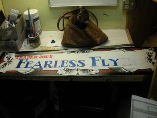
This is were I've been 5 days a week for the past 3 or 4 years. Cozy isn't it? I make signs, large and small for Trader Joe's ( a national brand of neighborhood stores!! We cut out the middleman and pass the savings onto you!! We add ginger to everything!! yack yack yack). Well all that's true but looking at this I think you can see how someone can go a little stir crazy after a while, no?
Well as of this week, I'll get a little more fresh air. I've been getting a steady stream of freelance work making signs and chalkboards for people in San Gabriel, Pasadena, etc, enough to cut my work week down to 4 days. WEE!
So I can gripe for days about nitpicky junk but sometimes when I take a step back I remember how low stress and fun and silly my job can be so I thought I'd share what I'm up to every once in a while.
Today, on top of figuring out price changes and some run-of-the-mill maintenance I kept working on some end cap crowns for our fearless flyer. I'm sad I didn't think about taking pictures from the very beginning because it's fun to see how something can go from looking like total trash to actually presentable. The midpoint is always interesting to me, where one bad decision can make it look like total hell. That point for these came well before these shots when I was outlining the banner. Just an inch-around smaller is all it would take, and a coat less of white paint in the center.
Once the banner came out looking ok I figured we'd be in the clear. We used to have to decorate differently for each flyer but our regional or whoever wants us to streamline the process which means anythign I made this time around had to be more generic and more permanent. That just means blowing up text as far as I'm concerned and I like trying my hand at different fonts so I don't mind. That's a copy of the Flyer there under the sign near the ruler. I use my hands and fingers to make measurements and can spot centers and straight lines pretty ok.
I freehand the letters in pencil, just because I like the practice, but before I throw paint down I checked with a ruler to make sure my letters weren't tapering too much and wouldn't you know it? All my small caps were in an eighth of a inch of each other on all three boards :)
Here's two of the three in progress, side by side. Never underestimate the power of a drop shadow. See the difference?
Loving Windsor Blue.
So after they all get a little drop shadow action I need to strengthen the backs and attach a mounting bracket. Here comes the 1/2" x 1"s and a few L-Brackets and then . . .
New project!
The boss needs this Rosenblum wine sign done el quicko. For the small wine chalk signs I like to keep it quick so most of the time I'll write the name out in my own loose Trader Joe's font but the Rosenblum spoke to me so I went with their text style. Textstyle. That's a good name. Taken. Just checked.
Anyway.
Here's some chalk lettering, done freehand again.
This is how I check to see if I'm straight and keeping the same letter height consistently. Just look at it from the side! Foreshortening. Fore sure.
I save the bigger letters for last.
It turned out fine. And so did the headers! Trader Joe's doesn't like to have blank anything in the store so on the back I whipped out a little leaf print. For now.
Subscribe to:
Post Comments (Atom)


Best sign artist in the whole freaking company. I'll put money on it
ReplyDelete